
Colour in Small Spaces: What the Evidence Actually Says
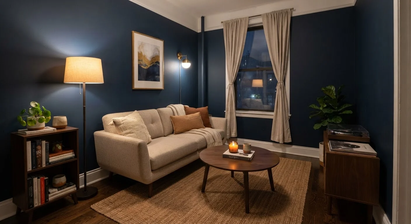
Photo credit: InsightsGrove.com | Discover Joy In Reading
In this article
Dark walls in small rooms aren't always a mistake — and white doesn't automatically open up a space. A fact-grounded look at colour and perception.
Key Takeaways
- White walls don't automatically make a small room feel larger - contrast and light matter more.
- Dark colors can actually make a small space feel more intentional and less cluttered.
- Ceiling color has a measurable effect on perceived room height.
- Color saturation and finish affect how a room reads as much as the hue itself.
- Personal comfort in a space matters alongside any perceptual effect of color.
Where the "Always Use White" Rule Came From
The idea that small rooms must be painted white or off-white is one of the most repeated pieces of interior advice - and one of the least examined. It traces partly to mid-century design principles that equated light colors with openness, and partly to staged real estate photography where neutral walls photograph well under bright conditions.
The problem is that a real lived-in room isn't a photograph. Perceptual research on spatial cognition suggests that how large a space feels depends on multiple interacting factors: luminance (how much light a surface reflects), contrast between surfaces, visual complexity, and furniture scale. Color is one variable, not the only variable. As we unpack the myths below, you'll see that the evidence points to more nuance than any single rule allows.
For context on the other variables that shape perceived space, the role of lighting in compact rooms is worth understanding alongside color choices.
Myth
You should always use white or very light colors in a small room to make it feel bigger.
Fact
Light colors can help, but they are not universally superior. A white room with poor lighting or high visual clutter may feel just as confined as a darker one.
The perceptual effect of color on space depends heavily on luminance - how much light a surface actually reflects under real conditions. A bright, naturally lit room can carry medium or even deep tones without feeling closed-in. Conversely, a north-facing room painted white but lit only by a single overhead bulb may feel flat and cramped. Environmental psychologists studying spatial perception note that contrast between surfaces (floor, wall, ceiling) often contributes more to perceived spaciousness than absolute wall lightness.
Myth
Dark walls will always make a small room feel smaller and more oppressive.
Fact
Dark colors can create a sense of depth and definition that some people find more comfortable - and less visually anxious - than a stark white room.
This myth treats all dark colors the same way, ignoring the difference between a muddy dark color used on all six surfaces (including ceiling and floor) and a considered deep tone on one or two walls. Interior designers sometimes use darker accent walls deliberately to create perceived depth - the eye reads the receding surface as further away. Research into color and mood also suggests that deeply saturated colors can feel calming and enveloping rather than constricting, depending on the individual and the context. Oppressiveness tends to come from low ceilings combined with dark ceilings, not from dark walls alone.
Myth
Ceiling color doesn't really matter - only the walls affect how a room feels.
Fact
Ceiling color has a documented effect on perceived room height, and is arguably the most underused tool in small-space decorating.
Studies examining how people estimate room dimensions find that lighter ceilings are consistently perceived as higher than darker ones, even when the physical height is identical. The effect is amplified by vertical elements - tall bookshelves, floor-to-ceiling curtains - that draw the eye upward. Painting a ceiling even one or two shades lighter than the walls can measurably change how tall a room reads, at very low cost. The reverse is also true: a dark ceiling in an already low room tends to make the space feel more like a basement than a deliberate design choice.
Myth
Monochromatic color schemes (same color everywhere) make small rooms feel seamless and larger.
Fact
True monochromatic schemes can reduce visual complexity, but they can also flatten spatial cues the eye uses to judge depth and dimension.
The logic behind the monochromatic argument is that eliminating contrast removes visual boundaries, making the room feel like one continuous surface. There is some support for this in terms of reducing clutter. However, spatial perception partly relies on contrast to judge where surfaces begin and end. When walls, skirting boards, trim, and ceiling are all the same color, the room can look like a model rather than a livable space, and the eye has fewer reference points for estimating depth. A variation approach - same hue, different values or sheens - tends to work better than a flat single tone throughout.
Myth
Cool colors (blues, greens) always make rooms feel more open; warm colors (reds, oranges) always close them in.
Fact
Temperature associations with color are real but subtle, and they interact with saturation, lighting, and personal perception in ways that make blanket rules unreliable.
Color temperature does influence mood and spatial perception to some degree - cooler hues are associated with distance and calm, warmer ones with proximity and energy. But the effect size is modest and heavily context-dependent. A low-saturation warm color (a soft terra cotta, for example) may feel more open and airy than a highly saturated cool color (a vivid teal). Saturation - the intensity of the color - appears to have as strong an effect on perceived weight and enclosure as temperature does. The most useful approach is to test actual paint samples in the real lighting conditions of the room rather than relying on temperature rules alone.
Putting the Evidence to Work in Your Space
Understanding what the research actually says gives you more options, not fewer. A few practical principles follow from the evidence:
- Match finish to function. Matte finishes absorb light and reduce the appearance of surface imperfections; eggshell and satin finishes reflect slightly more light without creating harsh glare. In a small room with limited natural light, finish can shift the feel more than hue.
- Use the ceiling strategically. Painting the ceiling a shade or two lighter than the walls draws the eye upward and can make the room feel taller. The complementary approach - a darker ceiling - can feel deliberately intimate rather than oppressive if the walls stay lighter. See also how vertical space is used in compact apartments for related strategies.
- Reduce visual noise before choosing color. Clutter and mismatched furniture scale create more of a cramped feeling than wall color does. Furniture proportion is often the underlying issue when a freshly painted room still feels tight.
- Test with large swatches. Paint color shifts significantly depending on the light source and time of day. A 12-by-12-inch swatch on the actual wall, observed over 24 hours, is far more informative than a paint chip.
~30%
Variation in perceived room height from ceiling color
Environmental psychology research has found that ceiling lightness can shift perceived height estimates by roughly 30% compared to a matched dark ceiling, even in identically sized rooms.
LRV
The metric that actually predicts lightness
Light Reflectance Value (LRV), printed on most professional paint data sheets, measures the percentage of light a color reflects - a more reliable guide than hue name or chip appearance.
None of this means every design decision must be optimized for perceived square footage. A small room that you genuinely find calming or interesting is a better outcome than one that follows the rules but feels sterile. Décor approaches that prioritize appearance over function often miss this point entirely.

Author
Home & Living Editorial Team
Home & Living Editorial Team is the collective byline for our editorial team and contributor network. Articles published under this byline or an editorial pen name are researched, written, and reviewed according to our editorial standards for clarity, consistency, and independence before publication.
View all articles →